These light trails were made by using a low ISO and slow shutter speed in a dark room and using two torches to create the light. The shutter speed for the photo above was set to 15 seconds so any movement of the torches in front of the camera was picked up by the camera making these light trails possible.
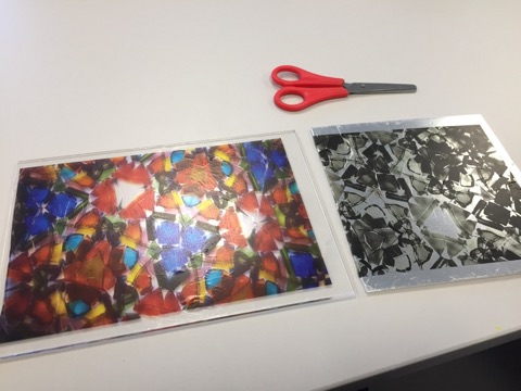
Polaroid photography
The first thing I did for this section of the workshop is create a background for the polaroid:
Then I got the Polaroid taken cut of the white line above the image with scissors and peeled the back off of the Polaroid so that the colour of the background would come through the back of the Polaroid and so it would stick and then attached it to the background.
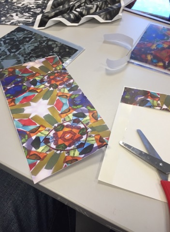
Film printing
For this part of the workshop, I cut out a film, place it into water for 50 seconds then placed the film unto the surface that it was to be printed on and pulled the paper away from the film so that it would print onto the surface, the end result looked like this:
Image weaving
For this part, I cut horizontal strips of an image and taped them onto a piece of paper, in order by using double-sided tape. Once I had done that I got a black and white version of the same image that I had used and cut verticle strips then I weaved them into the horizontal strips to create an abstract image.
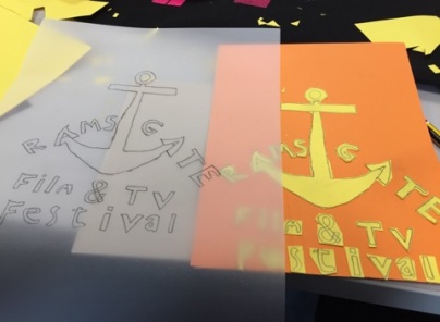
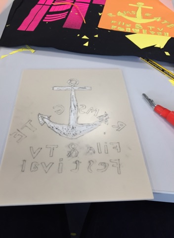
In the workshop, I created a lino carving of a poster like design for Ramsgate film and TV festival I did this by first thinking of the design which I decided to use an anchor because it is related to both Ramsgate film festival and Ramsgate in general but I decided to use both of the hooks of the anchor for the two A’s in Ramsgate.
After I had thought of the idea I cut out to pieces of paper to the same size as the lino and then I drew out the anchor and the bubble writing that I was going to use on the first piece of paper, cut it and glued it onto the second piece of paper.
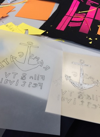
I then traced it.
And printed it inverted onto the lino. The reason the text had to invert was because if the text was the correct way round it would have printed inverted.
Then I began carving it out, one of the biggest mistakes that I made was that I used the wrong end of the blade when carving which I only realised was the reason I was having a hard time carving until halfway through.
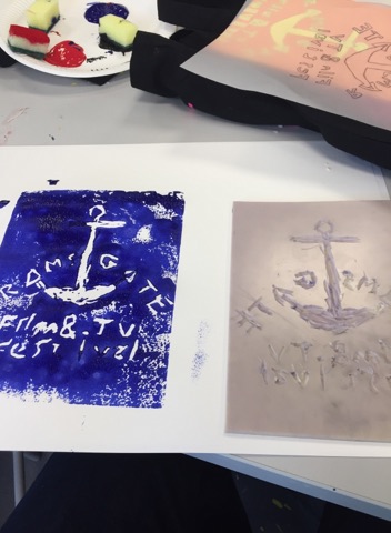
Then after that, I put paint on the lino and printed it onto the page
The print wasn’t great because I carved the lino quite poorly and should have taken my time on it more.
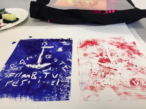
I also printed out a red version but should have used more paint.
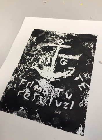
and a black version that went about as well as the first one.
This short film was made as a 1 day filming challenge to create a short film on the theme of power, so we chose to make an informational awareness video on the power of climate change and pollution. In the group of 2, we both made an edit, this edit was not used which I regret as I personally think my edit better suits the purpose of the video compared to the edit that we used. and I wish I put more effort into convincing my teammate to use my edit. Nevertheless, I wish that we made done more pre-production like a shot list and storyboard, although this was hard as we had extremely limited time and a lot of the pre-production time was taken up with research and idea development.
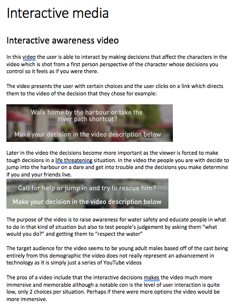
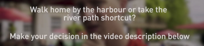
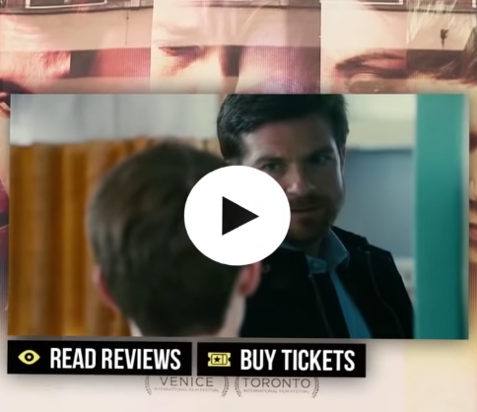
In this video, the user is able to interact by making decisions that affect the characters in the video which is shot from a first-person perspective of the character whose decisions you control so it feels as if you were there.
The video presents the user with certain choices and the user clicks on a link which directs them to the video of the decision that they chose for example:
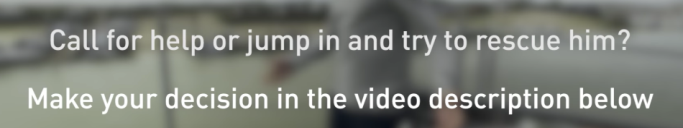
Later in the video, the decisions become more important as the viewer is forced to make tough decisions in a life-threatening situation. In the video the people you are with decide to jump into the harbour on a dare and get into trouble and the decisions you make determine if you and your friends live.
The purpose of the video is to raise awareness for water safety and educate people in what to do in that kind of situation but also to test people’s judgement by asking them “what would you do?” and getting them to “respect the water”
The target audience for the video seems to be young adult males based off of the cast being entirely from this demographic the video does not really represent an advancement in technology as it is simply just a series of YouTube videos
The pros of a video include that the interactive decisions makes the video much more immersive and memorable although a notable con is the level of user interaction is quite low, only 2 choices per situation. Perhaps if there were more options the video would be more immersive.
Interactive horror game
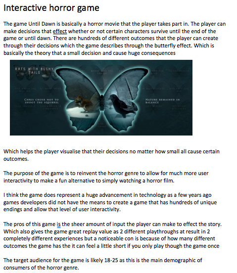
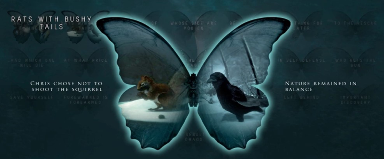
The game Until Dawn is basically a horror movie that the player takes part in. The player can make decisions that affect whether or not certain characters survive until the end of the game or until dawn. There are hundreds of different outcomes that the player can create through their decisions which the game describes through the butterfly effect. Which is basically the theory that a small decision and cause huge consequences.
Which helps the player visualise that their decisions no matter how small all cause certain outcomes.
The purpose of the game is to reinvent the horror genre to allow for much more user interactivity to make a fun alternative to simply watching a horror film.
I think the game does represent a huge advancement in technology as a few years ago games developers did not have the means to create a game that has hundreds of unique endings and allow that level of user interactivity.
The pros of this game are the sheer amount of input the player can make to affect the story. Which also gives the game great replay value as 2 different playthroughs can result in 2 completely different experiences but a noticeable con is because of how many different outcomes the game has it can feel a little short if you only play through the game once
The target audience for the game is likely 18-25 as this is the main demographic of consumers of the horror genre.
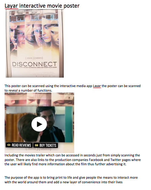
Layar interactive movie poster
This poster can be scanned using the interactive media app Layar the poster can be scanned to reveal a number of functions.
Including the movie’s trailer which can be accessed in seconds just from simply scanning the poster. There are also links to the production companies Facebook and Twitter pages where the user will likely find more information about the film thus further advertising it.
The purpose of the app is to bring print to life and give people the means to interact more with the world around them and add a new layer of convenience into their lives
The target audience for this app is very broad as their aim is for everybody to benefit from it so they likely don’t even have a specific target audience.
This example definitely shows a huge advancement in technology as this kind of interactive media has only existed in the last decade although is still not reliable enough to become mainstream.
The pros to the app are increased convenience and enhanced user interactivity
Some cons to this are the app itself, as so far the app has proven to be very unreliable and rarely works also the app requires an internet connection or data usage to use which is quite inconvenient when out and about which is what is promoted in the apps advertisements.
Example comparison
While it is quite hard to compare these three examples as they are so massively different from each other. In my opinion, Until Dawn does the best job in terms of its interactivity and reliability, and provides the best level of immersion whereas by contrast, I think that the awareness video has the least amount of user interactivity but is still good for what it is and fulfils its purpose. And the Layar poster is by far the most innovative and useful however is also the least reliable of the 3.
What is the future of interactive and augmented reality for media products?
In response to the common question of whether or not it is just a gimmick, in my opinion at the moment the answer is yes and no. No in the sense that there are a great deal of interactive media products that work almost perfectly such as my first two examples where and yes when it comes to augmented reality interactive print softwares such as Layar has a long way to come before it becomes reliable enough to become mainstream, Although I do think that the AR industry does have the potential to improve and become more than just a poorly functioning gimmick.
Despite this, more conventional interactive media such as video games and social media have proven that interactive media can be a commercial success although as interactive media moves into augmented reality the risk grows higher and higher that the product will be too unreliable or niche to be a commercial success.
One thing that is certain however is that interactive media is here to stay, and as technology advances I’m confident that it will become more and more mainstream, with products that today we consider to be unpractical or useless, improving to a point that they become a part of everyday life, with almost everybody using it on a daily basis, similarly to how mobile phone technology has improved over the last two decades.
The Ramsgate International Film and TV Festival (RIFF) is an event in Ramsgate that aims to present new works by local and international independent filmmakers while also promoting diversity and inclusion both in the world of film making and elsewhere, promoting filmmakers and embracing new advancements and innovations in technology in storytelling
The activity’s include screenings of film chosen by a committee of both filmmakers and local residents as well as workshops and seminars from industry professionals
Logo:
Slogan:
Photographic poster idea:
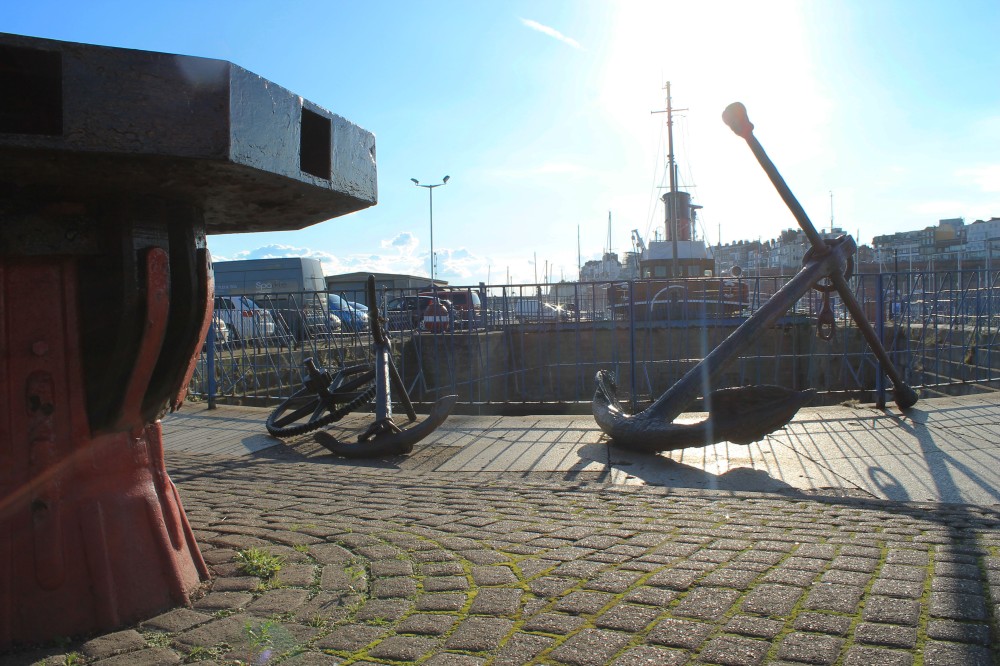
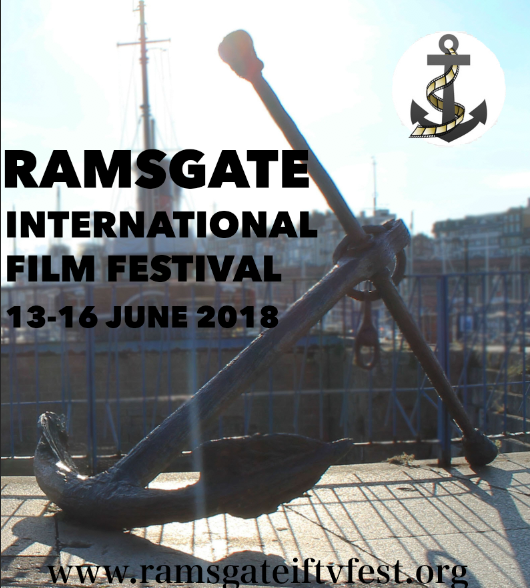
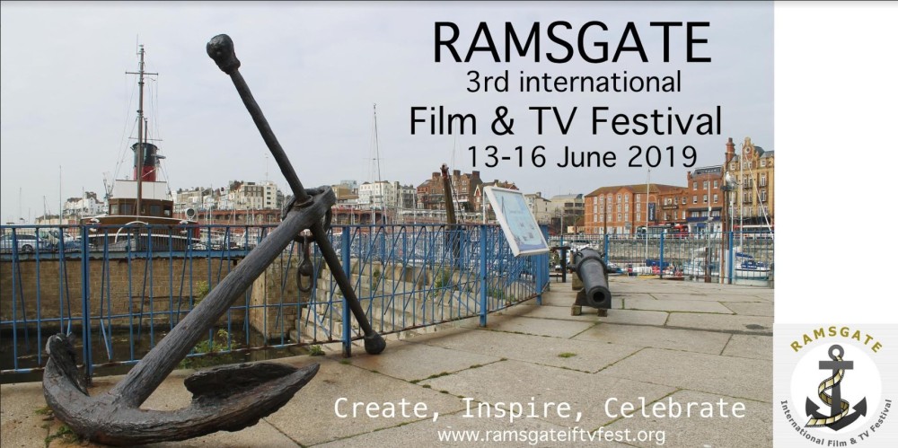
High quality image of ramsgate harbour that includes the anchor that resembles the RIFF logo perhaps similar to this image that I took last year but more emphasis on the anchor so that it is clearly the focus point of the photo as well as good negative space as there is quite a lot of information that has to be displayed:
Photographic poster idea 2
This idea is simply a picture of an anchor with a shallow depth of field so that the background could be used as negative space for the text similar to this but with perhaps more blur:
The use of a white bar at the bottom of the poster will be added if the poster wins in order to be able to add the logos of the sponsors without it interfering with the image
Making use of the negative space like this:
Obviously much less crude and also the photo will be landscape so the negative space could be used in many different ways, this is just an example of one idea that I have for the text placement.
Further development:
Bolder font version:
Idea 3
Find an object somewhere in Ramsgate seafront to be used as the main subject in the same way that the anchor in the photo above is the subject that has the harbour in the background that can either be blurred out using a shallow depth of field or kept in focus but with negative space in the background to allow for the text and logo.
One thing that I could implement is interactivity using Blipar and add links to their website, social media accounts and any other relevant information.
Firstly I’m going to talk about our effectiveness as a group, unfortunately, the groups graphic designer stopped attending college just before production was going to begin so me and the photographer had to fill in for him in graphic design. This was a major setback as we had to divert attention away from our areas and we would have been much more effective as a group if this were not the case.
In addition, another way we could have been more effective is if we communicated better with the band and collaborated more, as they didn’t have as much input as I would have hoped, and they seemed to often be out of the loop so to speak although this was mostly not our fault. As well as me and Ollie should have perhaps worked a bit closer and organised equal distribution of work as Ollie had very little to do with the planning of the music video for example, and I had little to do with the photography planning.
But on balance I think we did work well together as a group (Minus the graphic designer who wasn’t present for production) I think we communicated well with each other and were almost always on the same page. I also think that we shared ideas well with each other and were able to work effectively with each other during production which was most evident during the filming of our music video where I would explain a shot to Ollie for example and he would understand very easily, increasing our effectiveness.
The theme of the band was a pop-acoustic band that was focused on equalitarianism within the band and expression through music.
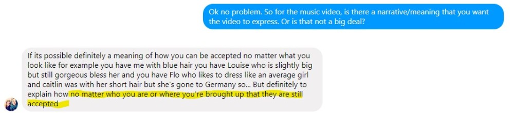
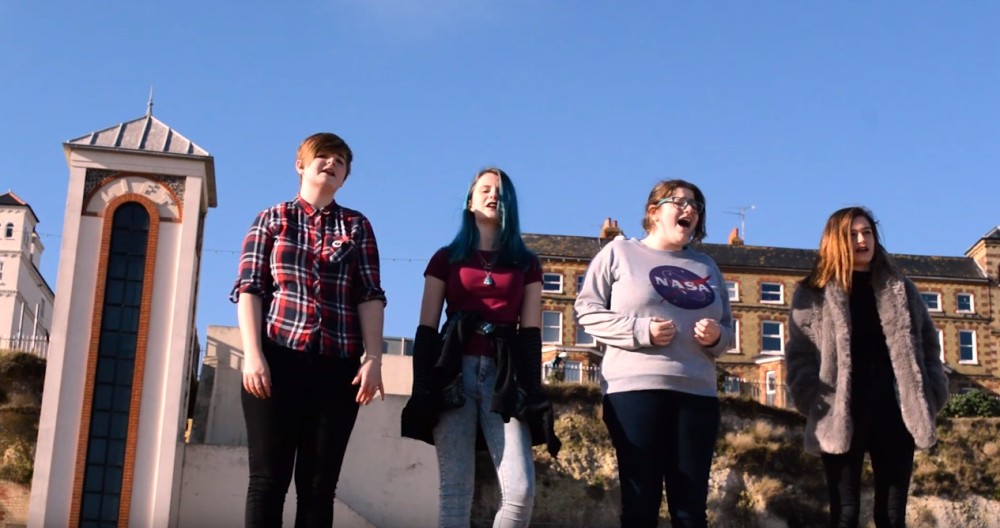
One of our biggest concerns was meeting the bands requirements, and one of the biggest requirements that they had was they wanted to be represented as an equal group with no one person having more importance than the others so that’s why in all of the media that uses their image (excluding the individual photography) it includes all four band members without anybody coming across as more important. we did this by organising them in a line for the music video and group photography so there was no band hierarchy and if you saw one of them, you saw all of them.
Another requirement that I felt we met was the bands heavy focus on expression through music. which we made sure that they were able to do by firstly having no input on their costumes during the music video thus allowing them to show off their style
And allowing them to be involved with the production of the band photography by letting them share and use ideas of their own for example the background of this shot was their idea
and this positioning was also their idea.
so essentially we didn’t wish to be too rigid and just tell them exactly what to do and where to do it because we thought this would reduce their expressionism and creative input.
Another requirement is they wanted their music video to tell a story, the story to put it basically is that all four of them have their own insecurities that they wish to be accepted by society and to spread the message that no matter who you are or your background you should still be accepted.
Telling the story through the video wasn’t really too difficult as the song almost tells the story by itself however I did try to tell this story by for example using a low angle shot during a powerful moment of the song in order to empower the band
and to have the band almost always be the main focus to show that they are proud and not afraid to show who they are and to be themselves. In addition, I chose to include close panning shots for the same purpose.
The objective was to capture them being themselves and I think we were successful
When we were in the idea development stage it was quite hard to research similar bands as they are simply not many pop-acoustic bands out there so instead we did our research through researching bands that had similar ideals as our band did and then we presented these ideas to the band and the feedback that we got determined the direction of our ideas. which I think was the perfect way to develop the ideas to make sure that we always stayed on course with what the band wanted and in my opinion, we did just the right amount of research to have a good idea of not just what the band wanted but how we could provide it effectively.
Inspirations
One of my biggest inspirations when during this project was this lyric video:
I was inspired by the use of kinetic typography and thought it would be a great idea to try and integrate that same use of typography into the music video.
Which I think worked quite well but would have worked perhaps a bit better if I had had more time to improve my skills with kinetic typography but nevertheless I am still happy with how it came out.
I also got some inspiration for the layout of the band members from some photography from a band called save the radio
I noticed how there was no band hierarchy in the photos and realised that that was exactly what our band wanted so I used the same line layout it in the music video and band photography. which in my opinion was a great choice because it meets the bands requirements.
Codes and conventions that we used.
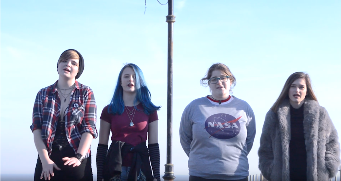
Location: we used many imperfect locations in the music video like the seaweed covered beach to symbolise the meaning behind the song that people are not perfect but should still be accepted despite their flaws.
Shot types: Low angled shots were used in order to empower the band during powerful moments in the song.
Lighting: We used natural lighting on location rather than artificial lighting to symbolise the bands message of being able to be natural without having to alter themselves to fit anybody’s ideas what they should look like which we then communicated through the video.
Costume: We didn’t have any input in order to allow them to express their own style and communicate that through the music video which is very evident as the band are wearing a wide range of different styles of outfits.
Props: we didn’t use any props during the music video as we did not want to take any of the audience’s attention away from the band.
materials used during the project:
Videography: Music video: Nikon camera, Tripod
Live lounge: Zoom Recorder, lighting, 2 cameras and 2 tripods videography
post-production Premier pro
Photography
Nikon camera, softbox lighting,
post-production: Photoshop
Graphic design: Illustrator, and photoshop
The main reason that we used these materials was that they were simply the materials that were available to us or were simply the equipment that was provided such as the live lounge in which we had no say in what was used. However, we did decide not to use equipment that we lacked experience with such as a DSLR slider as we didn’t want to complicate the production of the video.
One of the things that I enjoyed most about the project was all of the skills and new techniques that I learned through doing it. For example, before the project, I had had very little experience in film making and videography and had never done anything of this scale before, but now I feel my videography skills have greatly improved and I have discovered how rewarding it can be when you see the video that you visualised come to life. as well as I have improved my editing skills by using techniques such as kinetic typography and have gained experience working with quite a large amount of footage.
In addition, I learnt a great deal about how to work collaboratively with others both through organising and planning the project with my group partner to discussing with the band about their video, photography, etc to directing shots on film day and band photography. To working on a production set filming live lounges and working in a studio doing band photography.
And as a result of all of this working with others, I have developed skills in dealing with the pressure of my work being relied upon by others and have gained experience with working through stressful situations.
Furthermore, I’ve learnt a lot about working with a client because before the project I had never done a large scale client work project and now I know much more about having productive conversations to decide what is the best way to meet their requirements.
Also, I have learnt a lot about solving creative problems and thinking on my feet to come up with improvises and compromises to adapt when things don’t go to plan. For example when our band mentioned that they were not singing parts of the song on the set of the music video and I had to improvise by rearranging shots last minute and coming up with new ideas on the spot which worked to an extent but considering how unfavourable the situation was I felt it was effective.
There are a few things that I would change about the project firstly I wish that I asked the band for finalised audio before we shot the music video so that we could have timed each shot perfectly so that the song would flow as if it were recorded live. I also wish this because in the end the band never produced finalised audio for the video, luckily we had a solution which was an edit of the video made using the rough audio recording that the band sent us that we had prepared previously in case this happened that was named contingency edit. This, in my opinion, was a great idea to do because we knew that there was quite a large possibility that the band would not produce the final audio in time for the deadline. Something else I would have changed is about the music video, I would have better considered how the band would compare to the typography during the video as I feel at a few moments during the video the typography is more noticeable than the band members and diverts attention away from them which is a problem because the video is supposed to be all about them. I would have also used more still rather than back to back panning shots for the transition slides.
The client unfortunately hasn’t really given us much feedback which goes back to my point about how we should have perhaps communicated with the band more although they did mention that the reason that they didn’t record finalised audio was because they thought that it wouldn’t flow well not quite understanding that we just needed the finalised audio for the better audio quality. I did some primary research by showing a few people the bands music video to get their feedback which has been mostly positive.
In terms of how successful I think the final work is I would argue the final work is successful, I believe we met all of the previously mentioned requirements from the band and given them a good bases to get their band started and I am very proud of the work that we have produced for them despite some of its shortcomings.
This is a basic floor plan for the positioning of the equipment, instruments, and band members
Preparing for the studio photography
These photos were taken when me a Ollie were testing out lighting and camera angles ahead of the band photoshoot
The main goal for these photos was to get a better understanding of lighting and studio photography in general so that when we did the band photoshoot we would know how we wanted the lighting to be set up.
Interview planning
Questions
1. Where did you get the idea for the name “Eyes” from?
2. What genre would you consider your work to be?
3.What band or artist inspired you the most?
4. What inspired you to make music together?
5. Why did you choose “This Is Me” as your choice of song?
6. What got you into music?
7. What do you think would be the best way for you to improve as a band?
8. What do you enjoy the most about being a musician?
9. What is your bands target audience?
10. What is the biggest problem you’ve had to overcome so far?
This is the version of the music video made so that the band could lip sync to the video in order to produce the final audio for the finished music video, the edit does not include any colour correction or typography and some of the cuts have not been finalised. In addition this edit also served as a way for both us and the band to be able to visually look at what the music video was going to be like and make creative decisions before the reshoot date, however this applied more to a previous edit that we made pre reshoot as this draft edit was made after the reshoot was complete.
Contingency final video of the eyes music video
This edit has been made so that in case the band do not provide finalised audio for the video we still have something to use as the final edit, the audio used is taken from the rough recording the band gave us, the problem with this audio is it is occasionally quite choppy as the audio has to be edited into the video in order to be synced this means that some of the audio has been lost as the recording was not always sung at the same speed as the video meaning the song doesn’t flow as if it were sung live, however, I found that asking the band for draft audio was the best way to deal with that problem as we would have been in trouble if we had not organised that. The video also does include full-colour correction, typography, and finalised edits.
Update:
The band never made their final audio so the contingency edit became the final edit.
Contingency/final edit evaluation: The positives that I see of the video firstly is despite me and Ollie lacking quite a lot of videography experience and on top of all of the complications we faced, we still managed to make in my opinion a pretty good music video. The vast majority of the shots went almost exactly to plan and it was very enjoyable to see what I had visualised in planning come to reality. In addition, the audio syncing has been done very well by Ollie and I am happy with the typography that I added and I’m glad we chose to include it.
Some of the negatives of the video, in my opinion, include sometimes questionable colour correction that I think could do with being more subtle and consistent. For instance between 2:26 and 2:29 the colour correction are the complete opposite of each other, with one shot being very cold in colour and the next very warm.
Also, some minor focusing issues at 2:05 as the camera pans inward but does not adjust focus. Also, in my opinion, it would have been better if the first opening shot and establishing shot were longer as I feel there is simply not enough time to read the opening text. In hindsight, we should have reshoot both the opening and the establishing shot and made them longer.
While on the topic of the opening part of the video the establishing shot is slightly out of focus and should have been reshot but we forgot to. Also the location of the shots from 0:08 to 0:41 should have been shot at a different stretch of beach that didn’t have a pile of seaweed behind them as it is very noticeable and takes attention away from the band. Although on the flip side this could be interpreted as intentional as the setting behind them is not perfect which matches up with the meaning of the song “we’re not perfect but we should still be accepted”
Another issue is that the bands bags can be seen in frame at 1:34, this is honestly quite a frustrating mistake as we really should have realised this as we were setting up the shot and asked them to move the bags behind the camera. Luckily the shot does pan inwards so the bags don’t remain in shot the entire time but is still a very noticeable mistake.
Something that was brought up is the length of shot 27 (2:35 to 2:51) and how perhaps the shot was too long, I did consider breaking up this shot up a bit for the final edit but decided not to as the purpose of this shot was to be as empowering as possible which is why the shot has been placed at this low angle which I think justifies the length of the shot as it is needed to fully empower the band during this powerful part of the song.
The last issue I see with the video is the length of the group shots in transition sequence 3,(2:50-2:55) in my opinion they should be far longer, unfortunately these shots were filmed during the reshoot so were unable to be reshot as there were not enough problems post reshoot to justifiably plan a second reshoot.
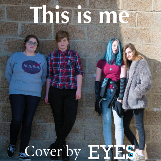
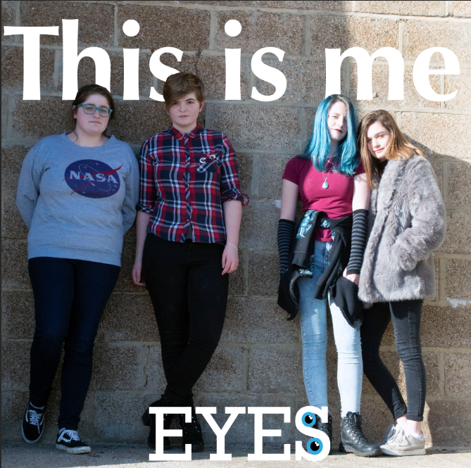
The first version of the album cover
This is the first version of the album cover, the photo is taken from the first band photoshoot that we did on location of the music video, the font is Optima for the song title, I used this font as it is the same font that I used for the typography for the music video. I later decided to remove the “cover by” as it is redundant.
Album cover
This is the final version of the album cover I decided to make the header much larger and also placed behind the band members for the added effect which I did after being inspired by this album cover
Something else of note is because I used the same image for the album cover and interactive poster so if you scan it Blippar registers the image and displays the video which was not intentional but is a cool feature.
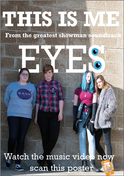
Interactive poster
The thought behind this interactive poster is I wanted it to share a similarity with my album cover while also being its 1is own thing so I used the same image and the same text behind the subject technique and style, but I decided I would match the font for the header and body text with the font of the logo, as opposed to matching it with the font of the music video typography as the logo is a much more prominent feature of this poster than the album cover.
Interactive poster version 2
I made a few alterations to the poster with the goal of reducing the amount of text so that the focus of the viewers wouldn’t be taken away from the photography. I did this by getting rid of the text about the greatest showman which I think is a good solution.
Interactive poster test (screen)
This is just a basic test that I did on Blippar. the first (on left) I did with just a youtube link that when tapped would direct the user to the music video, whereas the second test I did with the actual video which appears on the poster when scanned, I positioned the video below the header and logo on the poster so that they would look like a title above the video. The video overlay covers the band members because I thought It would be odd if you could see the band members on the video and the poster simultaneously.
Interactive poster in use:
The audio for the video is out of sync due to a screen recording issue although the purpose of the video is just to demonstrate that the interactive poster works.
Band photography (beach location)
This slideshow requires JavaScript.
The photography done at the beach was not overly planned out because at the time we were directing so much attention on the music video and also because we wanted to allow the band to express themselves rather than tell them what to do and have a creative discussion with the band once we got down there on what they wanted their photos to be like. the photography was done on the same day as the music video reshoot, in order to be consistent with the music video
Studio Photography
This slideshow requires JavaScript.
The approach that we took to this photo shoot is very similar to how we did the beach photography although with a bit more planning involved with lighting and backdrop etc, although we still wanted the band to be able to express themselves as they have mentioned that they are an expressionist band. And I think that our photos really do show that, for example, the photo where Amber is carrying Florence and the image where they are all covering their eyes. I think shows their unique style as a band.
The only issue that we had was there was another band preparing to film a live lounge in the same room and their lighting slightly interfered with ours.
Eyes live lounge
(Video and evaluation will be made/added once the live lounge footage has been sent to me)
(live lounge filmed but the footage was never received)
Eyes band interview
(organisation for the date and time of the interview in progress)
(Band were unable to to the interviews on the date we had hoped scheduling needs to be made for a second date)
(second date never organised, deadline missed)
Logo designs
The design process for the bands logo can be put into 2 halves, the first being the first two logos seen above, the original I made using Rockwell as the font because I noticed the very even and round circles that could be made in the capital S to fit the 2 eyes into and the lighter version I made in case the band wanted a less bold look. The other logos in the second half of the design process were made after the band mentioned they wanted a ying yang to be used so I created a few logos based on that.
This is a lyric sheet that I made in preparation for the music video reshoot. the green text represented the parts of the song that we had finalised shots for and pre reshoot the parts of the lyrics without
shots were red.
I printed these lyrics and brought them with me for the reshoot so I could make sure that the band were singing the correct part of the
song for each shot.
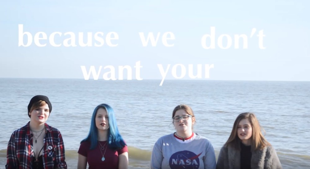
I am not a stranger to the darkHide away, they say'Cause we don't want your broken parts
I've learned to be ashamed of all my scars
Run away, they say
No one'll love you as you areBut I won't let them break me down to dust
I know that there's a place for usFor we are gloriousWhen the sharpest words wanna cut me down
I'm gonna send a flood, gonna drown them out
I am brave, I am bruised
I am who I'm meant to be, this is meLook out 'cause here I come
And I'm marching on to the beat I drum
I'm not scared to be seen
I make no apologies, this is meOh-oh-oh-oh
Oh-oh-oh-oh
Oh-oh-oh-oh
Oh-oh-oh-oh
Oh-oh-oh, oh-oh-oh, oh-oh-oh, oh, ohAnother round of bullets hits my skin
Well, fire away 'cause today, I won't let the shame sink inWe are bursting through the barricades and
Reaching for the sun (we are warriors)
Yeah, that's what we've become (yeah, that's what we've become)I won't let them break me down to dust
I know that there's a place for us
For we are gloriousWhen the sharpest words wanna cut me downI'm gonna send a flood, gonna drown them out
I am brave, I am bruised
I am who I'm meant to be, this is me
Look out 'cause here I come
And I'm marching on to the beat I drum
I'm not scared to be seen
I make no apologies, this is me
Oh-oh-oh-oh
Oh-oh-oh-oh
Oh-oh-oh-oh
Oh-oh-oh-oh
Oh-oh-oh, oh-oh-oh, oh-oh-oh, oh, oh
Look out 'cause here I come (look out 'cause here I come)
And I'm marching on to the beat I drum (marching on, marching, marching on)
I'm not scared to be seen
I make no apologies, this is me

Oh-oh-oh-oh
Oh-oh-oh-oh
Oh-oh-oh-oh
Oh-oh-oh-oh
Oh-oh-oh, oh-oh-oh, oh-oh-oh, oh, oh
When the sharpest words wanna cut me down I'm gonna send a flood,
gonna drown them out I am brave,
I am bruised I am who I'm meant to be, this is me


 The objective was to capture them being themselves and I think we were successful